Showing posts with label Tim Holtz. Show all posts

Thursday, May 23, 2013

Blueprint center panel step card


I saw this design for a Center Panel Step Card posted via the Splitcoast Stampers site. It was done as a 5x7, so the center panel was quite large, This is done as an A2 size, but still offers a lot of room for embellishing!


I used watercolors & perfect pearls on watercolor paper to work with the oak leaf blueprint stamp by Tim Holtz.


I made this layering piece from Glassine paper. I used Distress Paint in Antique Linen for the base, misted it with water and dryed it. Then I placed a stencil on top, spritz with Terra Cotta ink from Tsukineko and Funky Fushia Dylusions sprays. I also went over it with Teal Tattered Angels.
I crumpled up the paper after I had dried it, hit it with a little water, recrumpled & dried it. It looks so cool in real life and has a different feel to it!


I used various Washi Tapes, a library card cut up and made a metal specimen tag to add to it.
The card offers quite a bit of space to embellish and folds flat for mailing.
 
 
This card is also known as a Front panel step card.
Here are the dimensions so you can give this a try!
 
Start with a piece of cardstock 8.5 x 5.5"
 
Cut 2 slits parallel to the long side of the card stock :

Mark your paper 1" in from the right edge, 1" in from the left edge,
Begin the cuts 1" from the bottom/short edge cutting to the 5.25" mark.

SCORE:
on the OUTSIDE PANEL (1" wide panel) at:
1" (mountain fold)
2" (valley fold)
5.25" (valley fold)

on the INSIDE/CENTER PANEL (3.5" wide panel):
score at 4.25" (mountain fold) (score ONLY the center panel, NOT onto the 1" side panels)

The CENTER PANEL is 3.5" wide x 4.25" long
Each SIDE PANEL is 1" wide x 3.25" long

MAKE a prototype with copy paper first. Do this once, and it will all make sense!

To see other ways of creating this card to include a greeting, go to www.papercookies.blog.splitcoaststampers.com

Tuesday, February 26, 2013

Getting my Gelli Girl on with the Umbrella man….

IMG_2406


Sassy! This turned out as a ‘finished’ (more or less) piece right off the Gelli plate!

I had made a stencil AND a mask from the Umbrella Man Die by Tim Holtz & have used the pieces on numerous Gelli prints. I die cut it using stencil material by The Crafters Workshop. You can by 12x12 sheets of their very material!


The word IMAGINE was done using another Tim Holtz Movers & Shapers die, cut out of Co-ordinations cardstock. The cut piece was a little boring and needed some paint anyway, so a perfect use!


I also used a piece of punchinella, which is where the fun bubble design on the Umbrella man comes from.


I laid the cut stencil onto a mildly clean (ok, there's some residual paint) Gelli plate.

I used my brayer to ink his hat & shoes black, the umbrella red and a bad mix of deep green & blue for the rest of him…

I then covered the stencil with the punchinella & brayered white over the top of the Umbrella man.


The cardstock IMAGINE, I laid face down onto the Gelli plate, and then brayered red paint onto the backside, trying to keep the paint inside, where the letters were. You can see the texture of the cardstock surrounding the word.


Since the brayer had cool design from the white brayered punchinella, I ran that around the plate slightly to frame the piece.

I removed the stencil & puncinella, then I did laid my clean white cardstock onto the plate & pulled it off.

The color on the right was from a second pressing into Distress Stain I had put on the Gelli plate from another pressing. It just added a little color to the edge.


IMG_2407

IMG_2403

These 2 were done using residual paint & pressings from other inkings.

Mono Printing with the Gelli Plate & Embossing Folders

I JUST LOVE this technique. Now, I’m not saying I made this up (but maybe I did), but I haven’t seen it done elsewhere. Yet. So if you’ve seen this before, let me know. Otherwise, I’m coming up with a cool name for this technique. For now, we’ll just consider it an embossed mono printing technique.


So, if you’re like me, when you get a new die or embossing folder, you’ll run cut or emboss SEVERAL pieces with no real purpose other than to try it out. I have folders FULL of these (you’d think I could actually get a completed piece of work done with this stash). I grabbed 2 that had a great design & depth. The Subway Texture fade from Tim Holtz and the other one by Sizzix. I’ll also include the Honeycomb.

I brayered acrylic paints onto my Gelli plate, and laid the pre-embossed (using tan Co-ordinations cardstock) piece into the paint.

IMG_2395

LOVE LOVE LOVE the look of this!

I can see doing this, A LOT. The finish from the paint (and I BET the new Distress Paint will work REALLY cool too) gives this a semi glossy finish, and will create a great resist to some additional inking with Distress Inks or Stains. It will also help keep the embossing raised when using additional wet mediums.

IMG_2366 IMG_2367

Above is the Gelli plate, after the embossed piece was pulled. (note to self, place a piece of white cardstock underneath for pictures). Because the Sizzix Texture Fades have such great depth, the text & design pulls so well, making for a great ghost print! I LOVE that the text WILL BE rightside facing in the final print. 
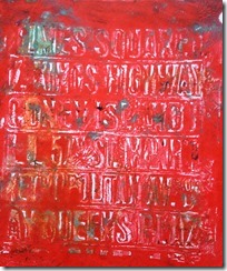
IMG_2396    IMG_2369 

TA Da!!! The image on the left is the print, onto white 110# cardstock. The image on the right, shows both the ‘print’ and the original embossed piece from the first press together.

Now there was a lot of paint on my Gelli plate, because I hadn’t done a print prior to putting the embossed piece in. Therefore, there was still quite a bit of paint for the 2nd print. The words are  distinguishable, and there is some white space.

What a great background this makes!!!!


Now this time, I had some paint left on my plate from a previous pulling, before I laid the embossed piece onto the Gelli plate.

IMG_2370

This is one reason why the cardstock piece on the right of this image, doesn’t have as much paint on it as the Subway piece in the first experiment.

You can see on the left side, the design on the Gelli plate, produced by the embossing folder.

Pretty sweet!


IMG_2371

This image shows white cardstock pulled off the Gelli plate, transferring the embossed design.

You all are going to L*O*V*E doing this!!!!!!!


These tags was done using the Honeycomb Texture Fade.
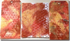
IMG_2392

The white piece in the center was the original embossed cardstock. The tags are the pulled pieces.

See what I mean? VERY COOL backgrounds!!!
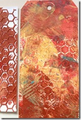
IMG_2393

Loving the idea? I know I am.

I can’t wait to work with some of the other embossed pieces I have just waiting for me!


I have a 6x6 Gelli plate, and am finding this to be a great size to work with for what I do. The paint stays pretty wet for the amount of time I need. While working with the 8x10, which again is a great size, the paint dries up a little quicker. I notice the difference.

Thursday, November 15, 2012

Body and Soul


I was lucky enough to be asked to design a class for a very talented group of friends who meet annually for an Art retreat. This was initially to be a spin on Tim's Heart & Soul and took a real 'hook' when the hearts I ordered didn't show. It became a HAPPY ACCIDENT, as the torso really made this piece SO much better for this group! The name 'BODY AND SOUL' was born, as were eight very unique pieces of art!


We used a medium configuration box, tissue wrap & tape, paint, Distress Stains & Inks, Alcohol inks, LOTS of Idea-olgy, vintage slides and various ephemera.


What I love when I teach, is letting each person create. I don't pick their colors, I give options. I let each person place components where THEY choose....


Everyone chats and feeds off each others ideas & the creativity blossoms.  This makes classes more fun and a better learning experience. Of course it adds to the length of time, but no one seems to mind!

I can't wait to teach this class again! It was a blast!!!!


Posted using BlogPress from my iPhone

Friday, June 15, 2012

First Flight


I was asked to join a new Yahoo group. A limited number of like minded creative talent at 50. It's a mixed media group. Not product specific, which I love because I use so many different products & mediums.


Our first swap is a tag. Mine is going to Neil in England. At first, I was going to do a sewing theme with a dress form. I already have that done. BUT, decided to switch it out with a more manly, steampunk, flight theme.


I had already done the background, and them my (or should I say another) package from Artistic Outpost came.

From the Diesel Punk set

PERFECT!


Diesel Punk

This tag also fits the June Referal progam theme of MASCULINE over at Artistic Outpost. BONUS!
I RARELY make things that fit ANYBODIES theme! LOL. Well, occasionally, but it's an on purpose.

I had already stamped the bi-plane from Pink by Design Flying High set and added foil highlight to it.

Flying High

The background had Distress Inks and Mists sprayed. There's actually a mask underneath from Tattered Angels, but you can't see it anymore. Remember when I posted below pic's of incomplete tags? Well, this is one of them.

There's plenty of Tim Holtz products used here too. The Pennant die was used to cut linen, the Numbers at the bottom, Gears, clock hands and OOOOOOOOO the Rivets & diamond plate Texture Fade!

You can see the 'hanger' I placed has a copper N charm & a dog tag (which I might smack around with a hammer before I finish & mail). Notice the jump ring? I put a spring from a defunced pen....
NO I DO NOT save everything! Geez, I can't believe you thought that.....


How do you love the log book??? Made it myself! I did watercolor the guys with Distress Ink & my Niji brush.

The stars at the top were stamped with Delicata by Tsukineko. GOD that ink has shimmer!
Delicata


This is a better view of the Gears & watch parts I added. There's also some washi tape & wallpaper tape in the background.


Friday, June 1, 2012

A "3D Matchbook ATC"!

Continuing along with my Matchbook design..... I've made this now in several different sizes.

Today, I am showing an ATC matchbook. What I love about this, not only do you have the constraints of the 2.5x3.5" facia, but a long thin inside to work!!!
Don't get me wrong. I do love the 'challenge of the 2.5 x 3.5" space. But let's face it peeps, WE'VE GOT STUFF and LOTS of it! According to my calculations, we'd have to make about a GA-ZILLION ATC's to use it all up!!!


I like to think of this design as 3D ATC Art. 95% of the stamps used are from Artistic Outpost. http://www.artisticoutpost.com/
I used both the LONDON CALLING & LONDON ELEMENTS sets.


The flag is leftover linen cut from the PENANNT Alterations Die. Have I mentioned how much I LOVE that die before???


And here's the INSIDER view! MORE THAN twice the ATC fun here!!!


Big enough to use the Hot Air Balloon from Tim's Remnants Set (CMS130). I trimmed it so separate at the matchbooks score line.

Added at the top, MORE linen Pennant flags!


For this piece, other than what's lised above, I used Cor-dinations cardstock, Archival Ink, Distress Ink, Distress Stain, Tissue Wrap and Pigment Markers.

AND because it's a 3D ATC, still plenty of ROOM to complete the backside with trading card information!


It's a cool design yes? Interested in a class? I think so!!!!


- Posted using BlogPress from my IPhone (never mind the typos).....

Thursday, May 31, 2012

Red, White & Blue Card

The COTM theme for JUNE @ WI Stampers is R, W & B.

I wanted to keep it simple & clean for a change. BELIEVE me this was harder for me than it looks. I wanted to add a collage image of a woman, but restrained myself....


The main stamps are from a set called bags of bunting by Dylusions for Ranger. Stamped in Crimson & Ultramarine Archival ink.


I stamped the 'stripes' using a stamp from the Americana Silhouette set by Tim Holtz.

OOOHHHH, and the "calligraphy", all mine (wink).

Wednesday, May 30, 2012

I made it myself!

I had this bright idea today.
Ok not brilliant but it executed well.

And I think I'll be making this style again!

Actually, I have, in multiple sizes...


If you look closely, I made a matchbook! The closure are made using 2 circle punches.


The stamp is vintage Tim! Lol!!! One of the first stamps I have by him! I colored it with markers before stamping. 2 sets of Wings & the hat are cut, and layered with black foam squres.
The background paper is from one of the Paper Stashes, inked on the edges with Weathered wood Distress Ink & stamped with a solid butterfly in pumice stone. The tag is a TIM a long with the verse stamped in archival.


This is the first run through below. Inspiration for the final design above. I decided it needed 2 scores at the top to give it more dimension, and 'fold' into the small fold up at the bottom.


The card is made from Tim's Paper Stash. It's inked on the edges with weathered wood distress ink.
The stamped coffee ring & splatters are inked with vintage photo and are part of an older stamp set.


The image is from Altered Pages and is done as an image transfer into PPA. Since I printed from my laser printer the image turned out nice & crisp.

The phrase is cut from the sentiment stamp set called Quotes & Quotables by Artistic Outpost. The stamp is great because while it's designed to be used as 1, it has lines that can be used individually! LOVE that!

Posted using BlogPress from my iPhone

Monday, May 28, 2012

Honor tag

This tag features dies cut from T!M's Alterations die Old Glory & the Rosette strip die. The word FREEDOM, and the background words & stars are from the Americana Silhouettes stamp set.


Them main image & word HERO is from the HEROS set by Artistic OutPost.

I used Distress Inks & Archival Ink to stamp and alter the background of this tag.


- Posted using BlogPress from my iPhone

Thursday, May 24, 2012

Happy memorial weekend!

This tag features the Americana stamps & Flag Bigz die by t!m Holtz .


Also stamps by Artistic Outpost and the Circles stencil by The Crafters Workshop.


After stamping Americana silhouettes in gold, I sprinkle antique gold embossing powder & heat set.


This is a card using stamps from Artistic Outpost (Heros), t!m's Americana Silhouettes and Rays Texture Fade.


Watercolored in with Distress Stains in Peeled paint, Faded Jeans & Vintage photo.

- Posted using BlogPress from my iPhone

Friday, May 11, 2012

My moms day card for my mom!

I have a "joke" with my dad. He calls me his favorite daughter.
I'm the only daughter (to the best of my knowledge)..
On both my mom & dads phones I'm listed as "favorite daughter " so couldn't resist stamping this in my moms card!


The lovely Flower & Mason Jar are by Wendy Vecchi's Studio 490 line. I LOVE this set! The Essence of ART (LCS080).


The mason jar is stamped onto dur-a-lar (an acetate). The flower is watercolored Distress Ink.


The tag, letters & Kraft glassine are Tim Holtz.
The background stamp is from Stampington & Co., and is done in Seedless Preserves Distress Ink spritzed with water. Overstamped w/a dot stamp in Worn lipstick.

HAPPY MOM'S DAY to all you momma's!! Enjoy your weekend!!


Posted using BlogPress from my iPhone

Look a card!


It's no secret I prefer tags. They're the "new card" for me.
But sometimes it needs to be a standard card format. Like the COTM (card of the month) I'm in.
This month is Masculine theme.

Life is good by Artistic Outpost.


The background way in the back is by PINK BY DESIGN called Olive Grove. The next layer is a Tim Holtz stamp, inked w/spring distress inks, spritzed w/water & stamped onto matte krone-cotte.


The fish is a Wendy Vecchi stamped w/Archival. Stippled w/Distress Inks & spritzed w/Perfect Mist in Biscotti.

- Posted using BlogPress from my iPhone